Project Overview
Tractor Movement Heatmap is a high-performance visualization tool for analyzing real-world GPS/RTLS datasets—originally built to show traffic and activity density for factory vehicles at Borusan.
You simply upload a CSV (with Lat, Lon columns) and instantly get a live, interactive 3D density map—ready to explore, present, or analyze movement patterns.
See the live demo:
traffic-map-daglar510.streamlit.app
Key Features
- Works with any CSV – just provide latitude and longitude columns.
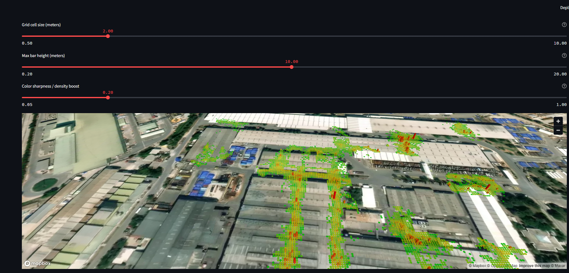
- Instant 3D heatmaps – grid cell size adjustable from ultra-fine (0.5m) to broad (10m+).
- Bar height and color sharpness controls – reveal subtle or extreme density variations.
- Green → Yellow → Red color scale – instantly spot traffic bottlenecks, hotspots, or idle zones.
- Interactive satellite basemap – real-world context for every point.
- Scalable for millions of points – works offline, or see the live online demo.
- Hover tooltips – precise density info for any location.
Demo Preview
Below: Example heatmap from a Borusan site dataset.
Each 3D bar height/color shows the number of GPS points in that grid cell.

How It Works
- Upload any GPS/RTLS CSV
(Lat,Loncolumns required—additional columns supported) - Adjust settings live:
- Grid cell size (resolution)
- Max bar height (3D effect)
- Color sharpness (density scaling)
- Hover to inspect – See real point counts per cell, not just “hot” or “cold” color.
No data leaves your machine – fully local app, but also available online.
Try It!
Open the live demo (Streamlit Cloud)
Example Data Format
assetId,assetName,updateDate,Lat,Lon
57ee4bdc-6018-418a-bbbb-a116b4bb85e6,16MEH31,2025-04-02T23:44:09,40.40727,29.09322
...
Technology Stack
- Python (Streamlit, PyDeck, Pandas, Matplotlib, NumPy)
- 3D map rendering on satellite basemap
Project by Dağlar Duman, 2025 –
For full code and documentation, see the GitHub repo.
